From 0 to Scale: Revamping a Scalable Experience for GE
I led the end-to-end revamp of GE Vernova's trade show experience, establishing a scalable design system flexible enough to power 5 product experiences across diverse industries, including solar, space, and agriculture.
Client
GE Vernova
Year
2025
Scope
SaaS B2B · Design Lead

Summary
Redesign GE Vernova's trade show real life experience to simplify decision-making and expand potential client range. The new experience reduced confusion and learning friction, increased user engagement across sales department and business partners.
Role & Scope: Design Lead
I led the end-to-end UX strategy and redesign of GE's tool dashboard, focused on improving clarity, personalization, and conversion. My work included:
Stakeholder alignment across Product, Sales, and Engineering
User research with internal sales sector
Usability testing
Dashboard UX/UI redesign
Define Problems & Opportunity
Redesign the experience to guide users through a complex technical information, helping them understand their business goals and accelerate the decision-making process.

Research & Ideation Process
I began by mapping out the initial conceptual steps and identifying all potential challenges, while referencing brand guidelines for data visualization to ensure proper colour hierarchy throughout. In order to navigate in ambiguity within the timeline, I decided drawing out wireframes and visualizing the concept is the best approach.
Strategy
I approached the redesign as a system of guided pathways based on user intent.
Progressive disclosure: Identified key information and keep the guide clear and direct
Simplified action model: Clarified hierarchy of CTAs to reduce cognitive load and emphasize next best action.
Colour hierarchy: Used one to two colour schemes and keep the guide and actual data separated
Web analytics: Integrated behavioural and web analytics to continuously optimize dashboard content.


Solution
Delivered a modular design system and clear guide to meet users when they are in search of new technology during trade shows.
Key experience features:
Tailored timeline indicator: user assurance and clear guidance
Context-aware CTAs: adaptive next-step guidance aligned with readiness level
Modular design system: consistent colour and typography to enhance clarity and learnability
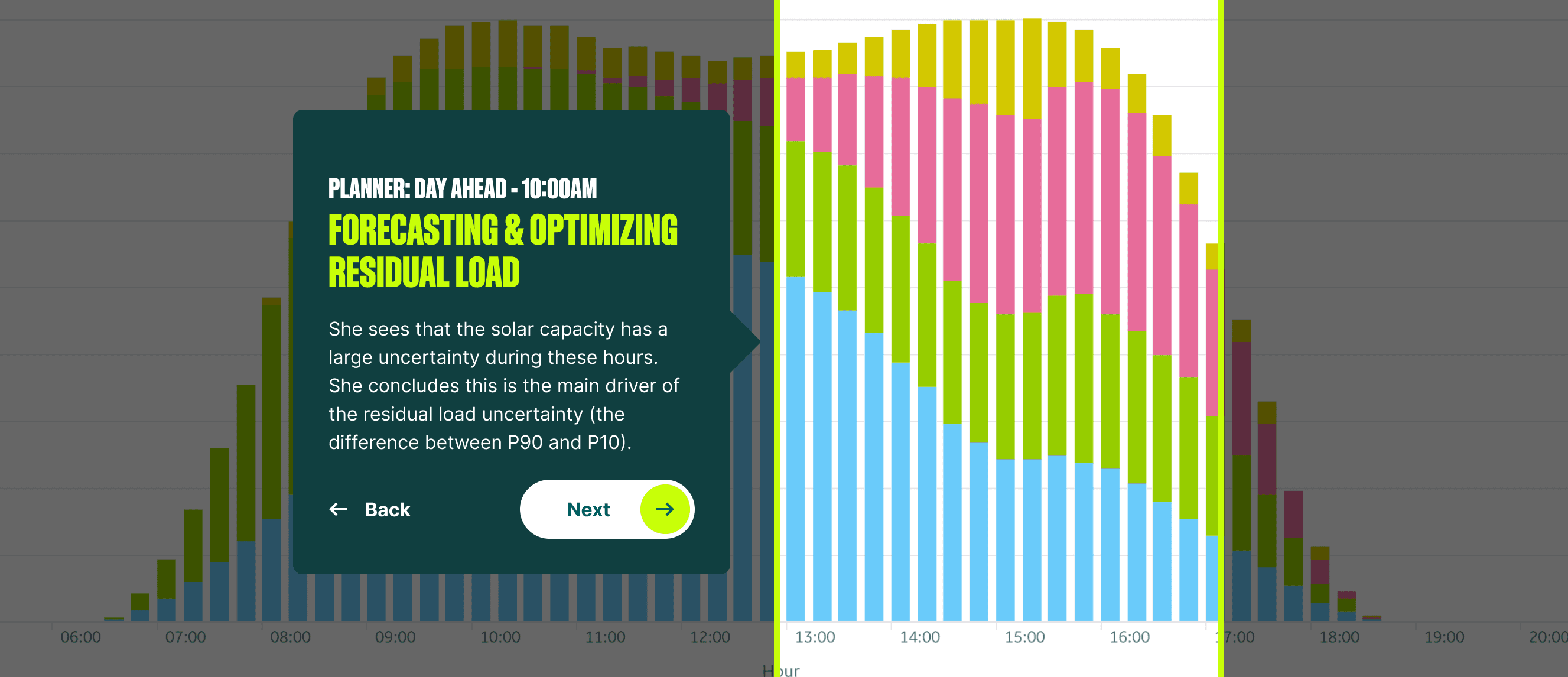
Customized data insights: contextual information about each product's data, features and numbers
Live analytics: web analytics feeding back into future optimization

Final Design & Impact
Continuously increased site traffic: Users revisited the demo after trade shows or as soon as after discussion at the booth, greatly improving conversions, sales number and brand visibility
Improved clarity: Buyers reported higher confidence in understanding their next steps
Validated direction: Moderated and unmoderated tests confirmed data and visualization transparency as key trust drivers
Higher engagement: On-site users interacted more with progress indicator features, extending long-term client relationship