Mrs. Fields: Redesigning the Path to Purchase & Revenue
A UX case study on reducing checkout abandonment and modernizing the shopping experience for an online cookie brand.
Client
Mrs.Fields
Year
2026
Scope
B2C · Design Lead · Case Study

Summary (TLDR)
Mrs. Fields is a beloved cookie franchise and e-commerce brand, selling baked goods to online to a largely older customer base. Despite steady traffic, the site was losing sales, customers were dropping off before completing a purchase, and the volume of customer service calls tied to checkout problems was climbing.
Role & Scope: Design Lead
To address these challenges, our team conducted a comprehensive review of the end-to-end purchasing experience and redesigned key conversion touch points across the website. The project focused on reducing friction, improving customer confidence and creating a more modern, intuitive shopping experience.
Role: Design Lead
Timeline: 1 month
Team: UX Researcher, Senior UX Designer, UX Intern, Marketing, Sales, Development
Tools: Figma, Microsoft Clarity, Google Analytics
Focus Areas: Conversion Optimization, Checkout Experience, Customer Journey, UX Research
Define Problems & Opportunity
The e-commerce business was experiencing declining online sales and increasing customer service inquiries related to purchasing issues. We hypothesized that:
Customers were encountering friction throughout the shopping journey, preventing them from progressing toward purchase completion.
The homepage, product listing pages, and product detail pages may not have been effectively supporting product discovery and decision-making.
Stakeholders believed the lengthy checkout process was a primary contributor to cart abandonment.
The overall experience appeared outdated and may have been reducing customer confidence and trust.
Our challenge was to understand why people were leaving at each stage, then redesign the experience to remove those obstacles while preserving the warmth and familiarity of the Mrs. Fields brand.

Research
To understand where and why people were dropping off, the team combined a heuristic evaluation of the end-to-end shopping experience, a review of web analytics to identify, high-friction pages and drop-off points and lastly, a comparative analysis against e-commerce best practices.
Homepage
Cognitive Overload: The same products were repeated across the page multiple times, making it feel cluttered without actually helping people with product discovery and progression into the funnel
Checkout flow
Shipping address was requested far too early in the checkout flow, disrupting e-commerce best practices and subverting users’ mental models.
Promo code placement was easy to miss or confusing, creating hesitation right before payment.
The flow itself was a 6-step process which was long and navigation between pages was poor, resulting in multiple opportunities to lose users along the way.
Multi-address shipping was appreciated by some customers but for most it was confusing and quietly inflated shipping costs. This was likely contributor to cart abandonment.


Product description pages
Key information such as ingredients, allergies, shipping details were buried in one dense block of text, making it hard for users to find the information they might need
No image carousel so customers couldn't easily browse multiple product photos.
Branding & trust
Product photography focused on the packaging rather than the cookies themselves, making it harder for customers to know what they were actually buying.
Little to no social proof (reviews, ratings) on the site which created meaningful trust gap for a food brand, especially with first-time buyers.
Error prevention
There was no 404 page at all so broken or mistyped URLs led to a dead end. There was no path back into the site and no explanation of what went wrong so users could diagnose the error.

Designs & Solutions
Given that the customer base skewed older and primarily shopped on desktop, the experience was redesigned with a desktop-first approach, rather than defaulting to mobile-first patterns.
Homepage
Replaced repetitive product blocks with a quick preview interaction, enabling faster scanning and comparison.
Reduced visual clutter by structuring content into clear sections and making carousel item counts visible, improving product discovery and funnel entry
Checkout flow
Condensed the flow from 6 steps down to 2 pages, cutting the number of decisions and screens between "add to cart" and "order placed."
Reorganized field logic (including moving shipping address later in the flow) so the process felt more intuitive and lower-commitment up front.
Introduced express payment options to eliminate manual form entry for returning or users with time constraints.
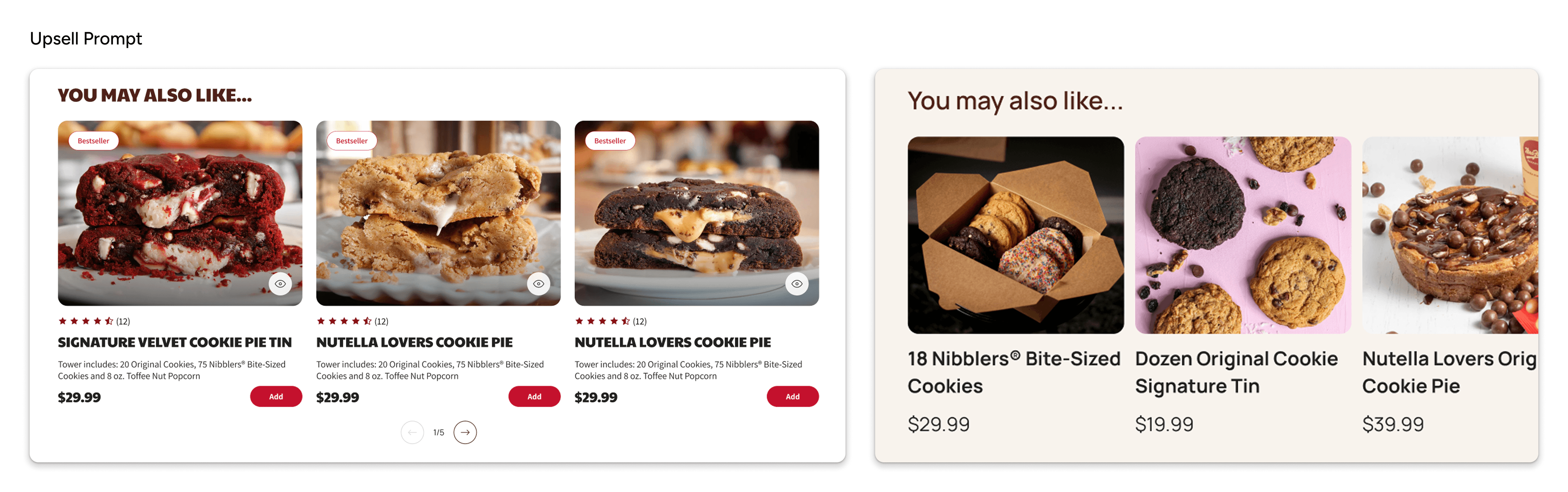
Added a mini-cart with subtle upsell prompts, transforming checkout into a conversion and revenue opportunity, not just a transaction flow.
Product listing pages
Introduced product tagging to support faster scan-based browsing and decision-making
Added quick preview functionality to reduce friction between discovery and purchase intent
Integrated upsell modules to shorten the path from browsing to cart addition
Product description pages
Replaced dense text blocks with accordion-based information architecture for ingredients, allergens, and shipping details
Simplified quantity selection, which previously required navigating through separate listings just to change quantity.
Added a product image carousel to improve visual exploration and purchase confidence
Introduced clear nutrition facts and contextual upsell placements
Suggested gift message options to reduce paper waste while adding a more delightful, personalized experience for gift recipients
Branding & trust
Refreshed brand direction to better align with company values, shifting toward a more human, playful, and approachable tone
Developed new photography guidelines prioritizing product-first imagery over packaging
Introduced customer reviews and ratings to strengthen social proof and first-time buyer trust
Accessability
The original UI leaned heavily on red, including a red hover state, which unintentionally read as a warning rather than an interactive cue.
Removed the red hover state and reduced red usage overall, shifting the palette to roughly 80% neutral tones with red reserved for the remaining 20%, used only for genuine emphasis.
Error Prevention
Designed a custom 404 page that was informative which helped users to recognize, diagnose, and recover from errors (aligned with Nielsen’s usability heuristics) and still incorporated an element of fun to enhance the site’s branding.


Impact
The redesigned experience, including the proposed branding direction , was reviewed and approved by stakeholders and is currently moving toward implementation and launch. While post-launch performance data is not yet available, the redesign directly addresses the key friction points identified in research:
Reduced checkout complexity and cognitive load through a shorter, more streamlined flow
Improved product comprehension through clearer information hierarchy and visual exploration
Strengthened trust with reviews, improved photography, and clearer product details
Upon implementation, we will measure success through changes in checkout abandonment, conversion rate and customer support volume post-launch. We expect to see:
Lower checkout abandonment due to reduced steps and decision friction
Higher product-to-cart conversion through improved scanning and comparison
Fewer customer service inquiries related to checkout confusion
Increased trust and first-time purchase confidence
Stronger overall brand perception while maintaining brand warmth and familiarity